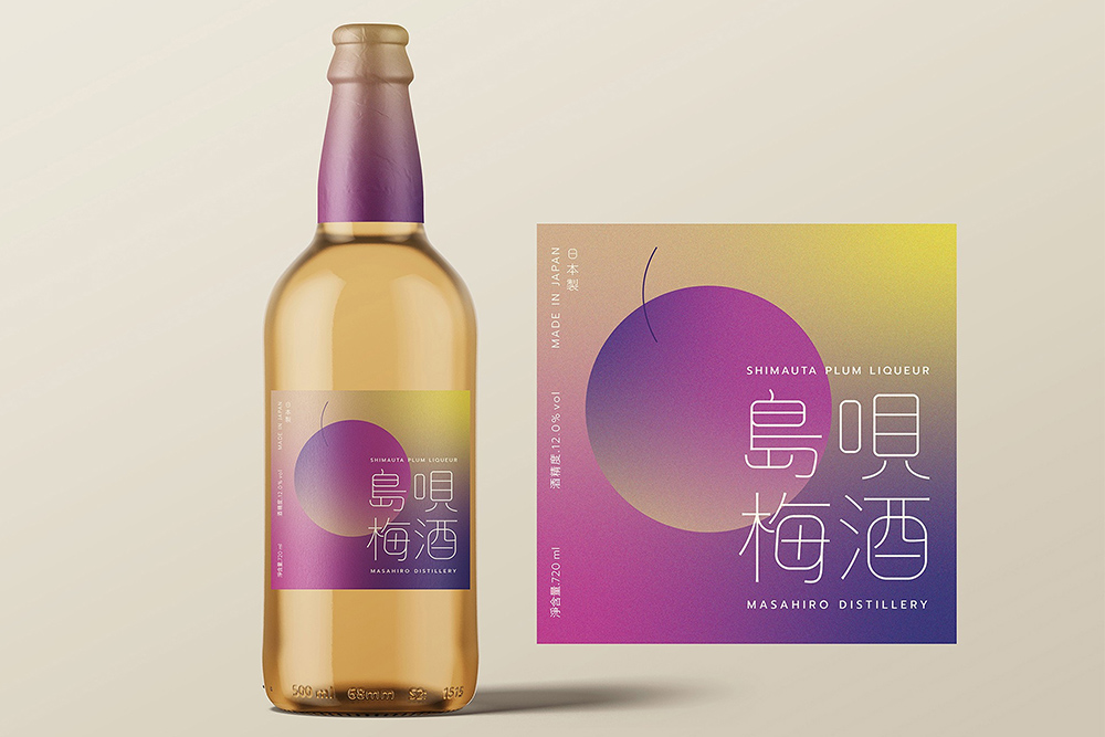
I am sure when I first came across this beer image, but I do recall how much I enjoyed the design. The color scheme, the simplicity of the text and the gradient pattern was something that intrigued me. These are the type of images that I store with the intent of recreating at some point.
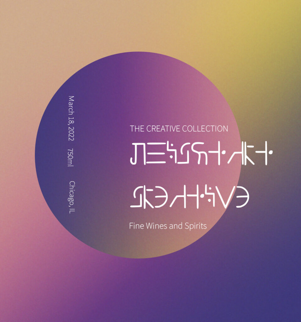
The first step in creating this is determining which method I would use to create a multi-gradient pattern. There are two primary ways of doing this: use a gradient adjustment layer or use a solid color adjustment layer and apply the gradient to the mask. I chose the latter because it felt like I had more control of the color scheme. Over the top of all of the layers, I added a 50% gray layer and applied some noise. This gave the label some texture.
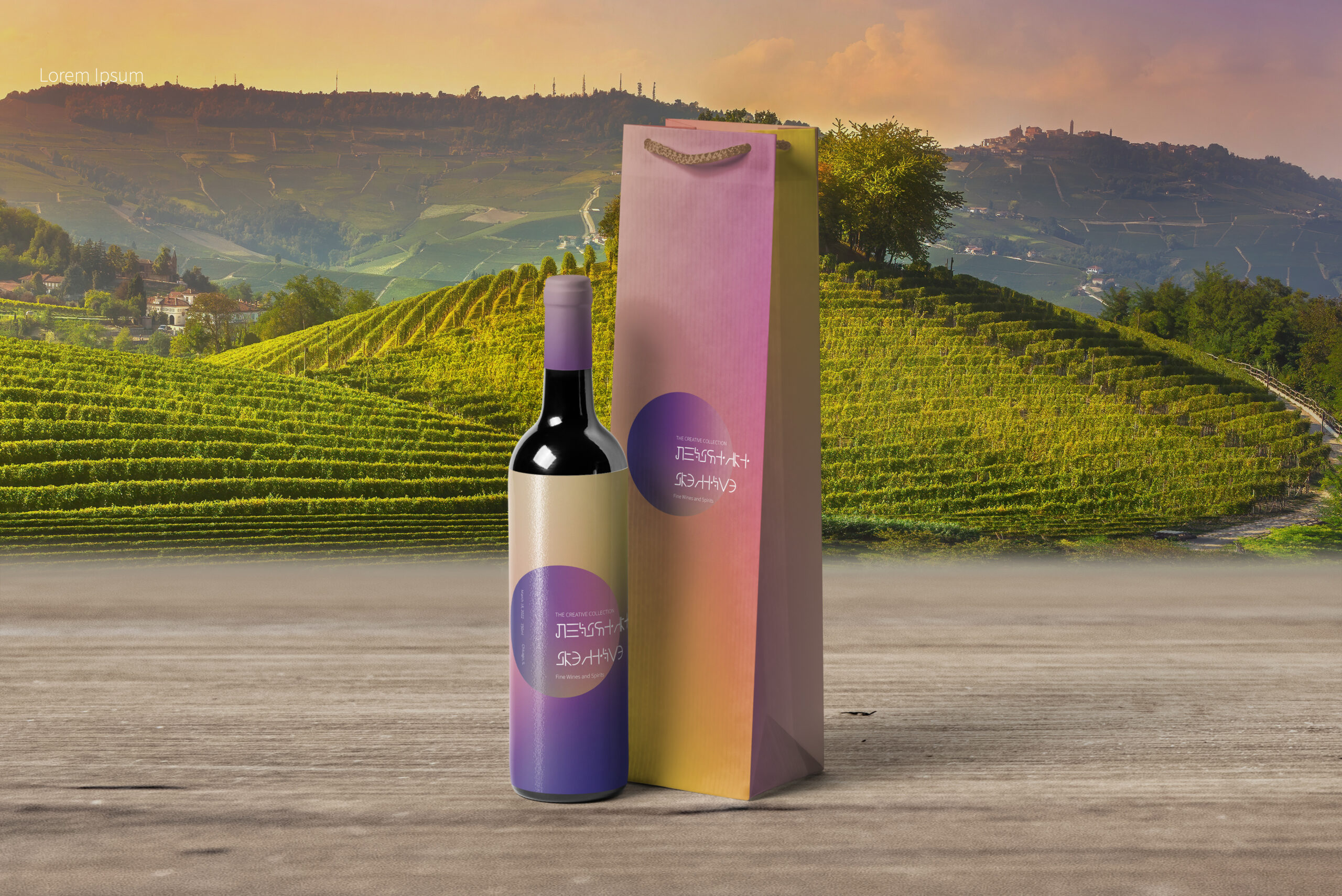
Once I was done with the label, I downloaded a wine bottle mockup from Envato Elements. Very rarely will I hardly ever create a mockup from scratch. There are so many assets available, it is not an efficient use of time unless I just wanted to practice.
Applying the images to the mockup is just a matter of plugging in the designs in the proper placeholders.
Final Image
The Inspiration

The Background


